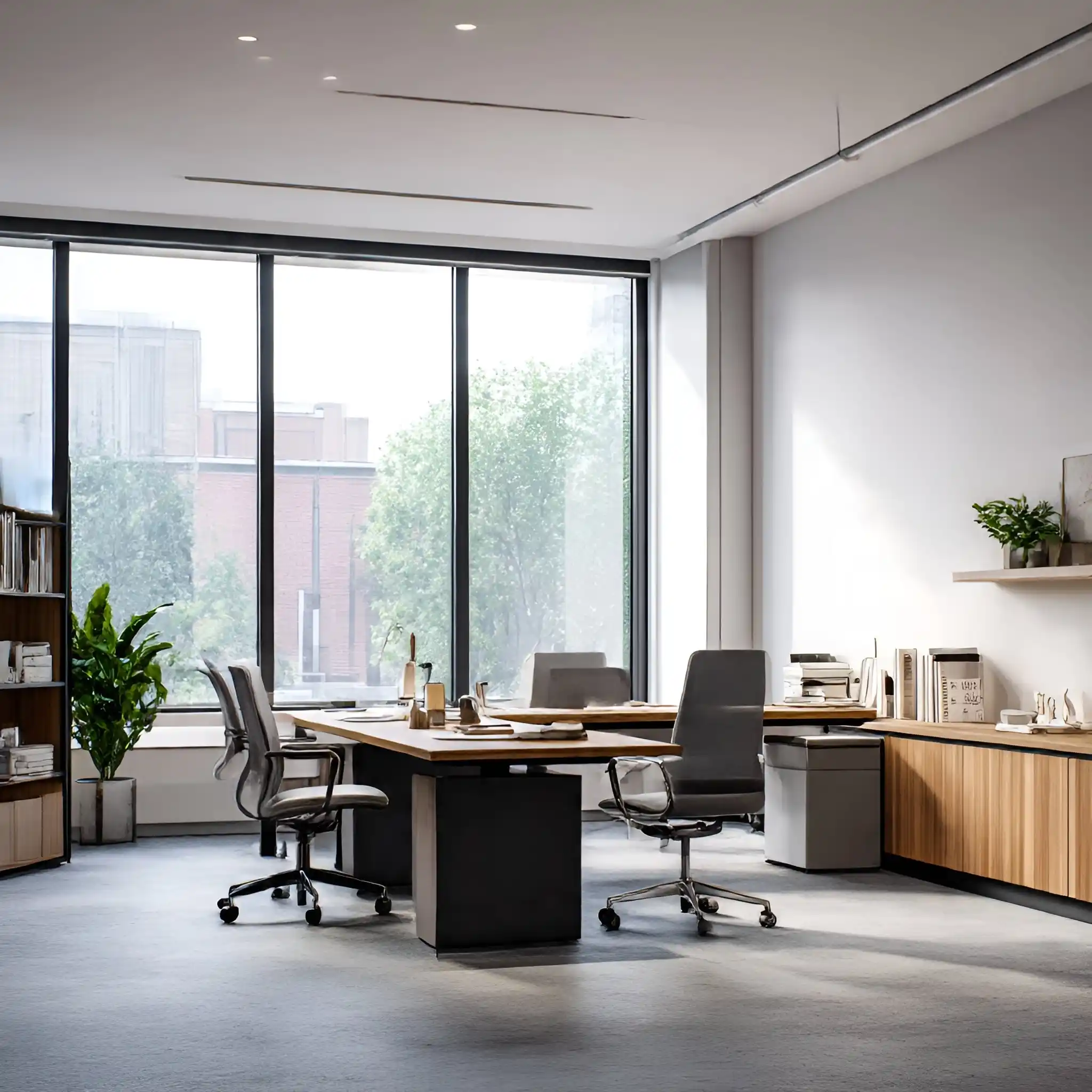
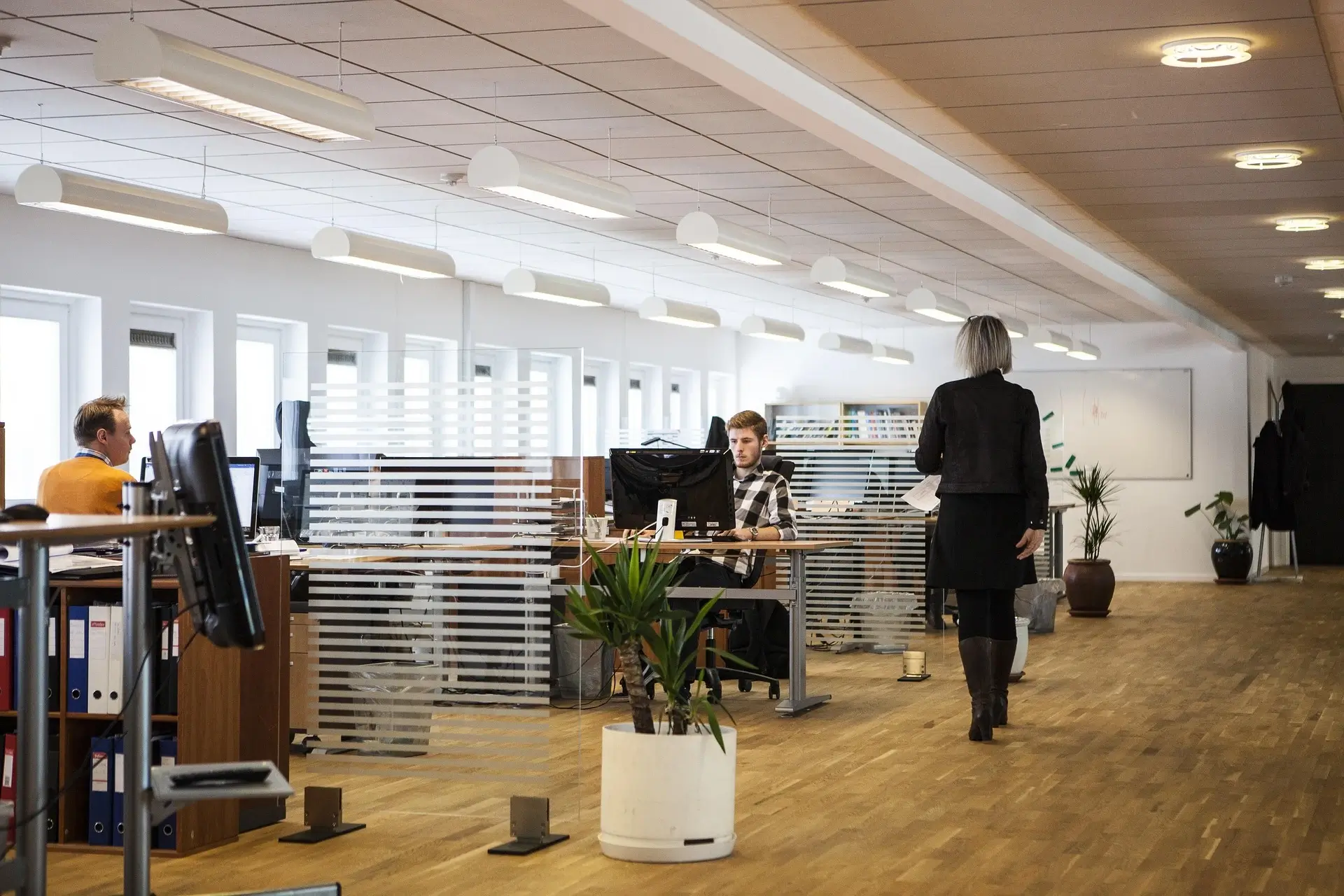
Color is one of the most underestimated tools in workspace design. You can fill an office with ergonomic chairs, premium lighting, and beautifully crafted furniture, but if the color palette isn’t aligned with the purpose of the space, the room will always feel a little “off.” After years of observing how teams behave in different environments, I can confidently say this: color quietly shapes behavior. It influences mood, focus levels, decision-making, and even the way people communicate.
Designing an office isn’t just about making a workspace look attractive—it’s about creating an environment where people feel comfortable, energized, and mentally supported. This is where strategic color selection becomes a genuine performance tool.
Below is a comprehensive guide on how to choose the right office colors, along with design theories, combinations that work in real-world spaces, and subtle psychological cues that influence how people feel in a workplace.
Why Office Colors Matter More Than Ever
Today’s work environments are doing more than just hosting employees—they must support hybrid schedules, reduce stress, strengthen brand identity, and offer a sense of comfort. Many companies underestimate how deeply color contributes to these goals.
Here are a few design truths professionals rely on:
- Colors with lower saturation tend to feel calmer and more professional.
- Bolder colors activate energy—but only when used intentionally.
- Neutrals shape the structure of a room, while accents influence behavior.
- Warm tones feel inviting; cool tones feel clean, fresh, and cognitive.
The secret is not choosing the “trendiest” color but the right color for your team, layout, and work style.
Understanding Color Psychology for Offices
While every individual responds differently to color, certain patterns repeatedly show up in workspace design.
Below is what each major color category tends to communicate inside offices.
1. Blues – The Focus Color
If a space needs concentration—like meeting rooms, planning areas, or technical departments—blue is the go-to. It naturally invokes clarity and calmness, making it ideal for analytical environments.
Why blue works in offices:
- Reduces stress and visual tension
- Boosts concentration
- Balances open spaces
- Pairs easily with neutrals like grey, beige, and white
Best for:
Workstations, conference rooms, home offices, reception lounges.
2. Greens – The Balance Color
Green is one of the few colors the human eye processes with minimal strain. That’s why it is frequently used in high-pressure environments.
Green elevates:
- Calmness
- Cognitive balance
- Visual rest
- Emotional stability
Deep greens feel sophisticated, while soft greens feel refreshing and spa-like.
Best for:
Creative areas, break rooms, wellness corners, hybrid work lounges.
3. Yellows – The Creativity Color
Yellow is like sunlight—it sparks creativity and raises the “perceived temperature” of the room. But it’s powerful, so using it sparingly makes it more effective.
Why yellow works in the right doses:
- Boosts creative energy
- Encourages brainstorming
- Adds warmth to neutral offices
Soft, muted yellows are more comfortable for long-term exposure than intense neon tones.
Best for:
Idea rooms, collaboration zones, café spaces, design studios.
4. Reds – The Energy Color
Red is bold, powerful, and emotional. It increases alertness and stimulates adrenaline. However, too much red in a work environment can cause restlessness.
Used strategically, red can:
- Encourage confidence
- Highlight important zones
- Add personality to dull corners
Use red as:
Accent walls, artwork, soft furnishings, or branding elements.
5. Neutrals – The Foundation Colors
No modern office works without neutrals. They are the quiet backbone of every palette—and the most common mistake is underestimating the range beyond white and grey.
Neutrals include:
White, black, greige, taupe, warm grey, charcoal, ivory, stone, sand.
Why neutrals matter:
- They shape the visual architecture of a room
- Make colorful accents more intentional
- Keep the workspace looking professional and timeless
Best for:
Walls, desks, cabinetry, flooring, and corporate areas.
Choosing the Right Color for Each Office Area
Color shouldn’t be random—it should be curated based on how each space will be used.
Below is a breakdown that interior designers follow when zoning out offices.
1. Workstations
Goal: Focus, clarity, mental comfort
Best Colors:
Soft blues, fresh greens, muted greys, warm beiges
Tips:
- Avoid overly saturated colors—they can cause visual fatigue.
- Earthy neutrals help teams feel grounded.
- Add subtle warm accents to prevent monotony.
2. Meeting Rooms
Goal: Communication, problem-solving, confidence
Best Colors:
Sage green, steel blue, charcoal with warm wood tones
Tips:
- Keep the color consistent around the perimeter to reduce distractions.
- Add warm lighting to compensate for cooler wall tones.
3. Creative Rooms
Goal: Brainstorming, collaboration, idea generation
Best Colors:
Mustard yellow, energizing orange, teal accents, soft peach
Tips:
- Avoid colors that are too heavy; you want a sense of movement.
- Layer the room with mixed materials (wood, fabric, matte surfaces).
4. Executive Offices
Goal: Authority, professionalism, comfort
Best Colors:
Deep navy, espresso, forest green, muted taupe
Tips:
- Darker palettes paired with rich textures feel sophisticated.
- Add metallic accents sparingly to avoid a cold atmosphere.
5. Reception Areas
Goal: First impression, brand personality
Best Colors:
Warm neutrals, soft blues, elegant charcoals, accent colors from your brand palette
Tips:
- Reception should subtly echo brand identity without overwhelming the eye.
- Avoid overly bright tones—they age quickly and feel less premium.
6. Break Rooms & Cafés
Goal: Relaxation, social interaction
Best Colors:
Cream, muted yellow, gentle coral, leafy greens
Tips:
- A slightly warmer palette works better in social areas.
- Combine color with soft seating and natural textures.
How Lighting Affects Office Colors
A mistake people frequently overlook: color doesn’t exist without light.
The same shade of blue can look corporate in daylight, but cold under fluorescent lighting. That’s why color testing is crucial.
Natural Light
North-facing rooms → cooler light → use warm colors
South-facing rooms → warmer light → use cool colors
East/West → variable light → test samples at multiple times of day
Artificial Light
Warm white bulbs → flattering for warmer palettes
Cool white bulbs → enhance blues, whites, and greys
LED panels → pair with neutrals to avoid stark contrasts
Top Office Color Combinations That Always Work
These curated combinations are reliable, professional, and modern—perfect for offices of any size.
1. Soft Blue + Warm Grey + White
A balanced palette ideal for large corporate offices.
2. Forest Green + Cream + Wood
Comforting, stylish, and timeless.
3. Charcoal + Gold Accents + Walnut
Luxurious without being overwhelming.
4. Muted Yellow + Soft Beige + Terracotta
Inviting and creativity-friendly.
Clean, calming, and structured.
Common Color Mistakes to Avoid
1. Choosing trendy colors without long-term thinking
Trends fade faster than office design cycles.
2. Overloading the space with accent colors
Accents are most powerful when used sparingly.
3. Ignoring how colors affect productivity
Colors can overstimulate or drain energy if misused.
4. Not testing colors in real lighting
Samples on a computer screen don’t match physical walls.
5. Using too many conflicting tones
Your palette should have harmony, not visual noise.
How to Build Your Office Color Palette (Step-By-Step)
Step 1: Define the atmosphere you want
Calm? Creative? Corporate? Cozy?
Step 2: Choose your base neutral
This is the wall-to-wall foundation.
Step 3: Pick your primary functional color
Blue for focus, green for balance, yellow for creativity, etc.
Step 4: Add 1–2 accents
Use them in décor, not over large surfaces.
Step 5: Layer with materials
Wood, metal, fabric, and matte finishes create depth.
Step 6: Test in lighting
Never skip this step.
Final Thoughts: Create a Workspace That Works With You
A thoughtfully colored office is more than a visual upgrade—it’s a performance tool, a mood stabilizer, and an extension of your brand. Whether you’re designing a home office, renovating a corporate floor, or refreshing a coworking area, your color choices should reflect how you want people to feel and behave in that space.
When colors are chosen with intention, the office becomes more than a place to work—it becomes a place where people want to work.


